Back before Bryan I did a post mentioning my plans to install draperies in the master bedroom. If you recall, the main window looked like this.
The plan was to install these draperies, this rod and then paint the rod gold so the end product looked like this:
Viola - so far so good. Not sure if I am going to do the antique gold on the rod or not. I may keep it black. What do you think?
Next step is to decide on a pattern to paint on the drapes. I'm thinking I like either the grey stripe or chevron. The black and white options seem too stark to me now that I have the draperies installed in the space.
Wednesday, November 30, 2011
Tuesday, November 29, 2011
Style My Nest: the Fireplace
Starting today I hope to do a weekly blog post (the operative word is "hope" since everything is sort of up in the air with the new baby) where I style a little corner of our home. With a limited number of accessories, there are certain areas where decisions have yet to be made stylistically. Instead of waiting for the exact right piece though, I figure why not use what I have to do a little accessorizing at least temporarily? It will give me good practice at styling a space and let me see the various options that might work for a vignette.
Part one is our fireplace.
Eventually I think a starburst mirror is in order and some tall urns among other things. but in the meantime I've created a little winter vignette with some IKEA frames and artwork I created a while back (that didn't sell in our recent garage sale), an oversized rustic wood snowflake that I found at a yard sale, and some of my collection of books and animals.
Next up is our bedroom dresser.
Monday, November 28, 2011
Better Late
Some Thanksgiving scenes from our house. I was inspired by Irene's post to do a little table styling and get out our fancy china.
Friday, November 25, 2011
Tuesday, November 22, 2011
Let there be Felt
This holiday season I'm really into felt toys for kids. There is a certain artisanal quality about felt toys that seems very of the moment (and certainly some of these finds are hand made and sold by artisans on Etsy). And I love that they come in everything from foodstuffs to campfires to tools. What are you digging for the holidays this year?
1. Tiny Felt Mushroom by MamaCOop
2. Felt Dumplings by Jakc
3. What a Croc by Land of Nod
4. Felt Toolbox by GulfCoastCottage
5. Felt Farm Fresh Egg by Fairyfolk
6. Felt Campfire by Hopewell Creek
1. Tiny Felt Mushroom by MamaCOop
2. Felt Dumplings by Jakc
3. What a Croc by Land of Nod
4. Felt Toolbox by GulfCoastCottage
5. Felt Farm Fresh Egg by Fairyfolk
6. Felt Campfire by Hopewell Creek
Monday, November 21, 2011
Guest Post: East Coast, West Coast - Part 1: The Rug
Thanks to my Boston buddy Michele of The Department of the Interior for her guest post today:
Since I'm still East Coast, we've been communicating via facetime, ivideo, email and texting. One afternoon he went on a rug searching bender.
The rug I really wanted him to get is this Ikea Stockholm Rand rug $199.00, but apparently they are sold out at every store in the country. He told me there was someone selling it on ebay for twice the retail amount. What's up with that?
So he finally settled on this shaggy Memphis Stone rug from Crate and Barrel. There's no wool in it so his feet won't get itchy.
My challenge for the living room now is to convince him that he needs a fabulous coffee table in a very bright color. Like this one made from the hood of a Camaro.
 |
| The Weld House |
Stay tuned for my post on Jay's Entry. It involves a map.
By the way, if you're wondering how I got my text messages off my phone, I used Decipher TextMessage, made by Decipher Media of which my now West Coast friend Jay is co-founder.
Thanks Jess for inviting me to post a guest blog on The Eagle's Nest!
Michele
Friday, November 18, 2011
Happy Friday
Bryan turns 1 month on Sunday and he is quite the porker weighing in at over 10 lbs now (from 6lbs 13oz at birth). Scott is taking the day off today for a little bonding with baby. Here he is tickling the ivories with Bryan.
Thursday, November 17, 2011
Guest Post: A Thanksgiving Table with DesignstILes
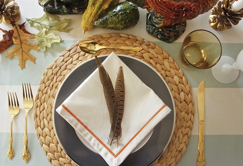
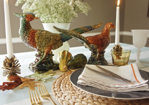
Hi Eagle Nesters. It's Irene from designstILes, filling in for Jess while she's on mommy duty. Thanksgiving is practically here and today I'm sharing an easy to create table setting fit for the food festive occasion.
When deciding how to decorate my table, I look through the items I already own and then fill in the blanks with pieces that fit my vision. If you have incomplete sets, don't be afraid to mix and match.


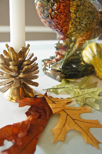
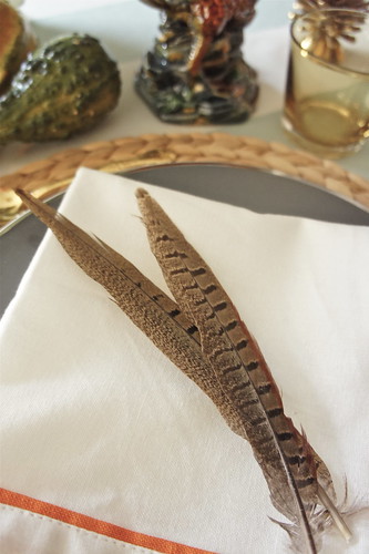
I'm always first inspired by color. Typical Thanksgiving colors are oranges, browns and yellows. To make things interesting, I add in an unexpected hue. For this table setting, I remembered I had leftover striped fabric in an ivory and celadon. I had just enough to use as a tablecloth. I then saw these ceramic pheasants at Z Gallerie and new immediately I'd want to use them. They're festive, add interest and bring in more color. The gray plate and orange trim napkin are also from Z Gallerie. The decorative pumpkins are from my local grocery store. The acorn candlestick holders were purchased at the flea market a few months ago. The stemware, vase and fake leaves were already pre-owned. I let my tablecloth inspire me and based the rest of my colors from there. I always like to add fresh flowers. I kept these simple so as not to detract from the pheasants.
Hope some of my tips helped you for your Thanksgiving table.
Happy Thursday!
Tuesday, November 15, 2011
Luxury Geometry
Love the patterned ironwork on the front door of the exclusive condo residences at 1212 Fifth Avenue. If I were to build my dream house I think it would have a clean boxy art deco look with glass doors and ironwork similar to this.
Monday, November 14, 2011
Front Planting Beds
Well, if you recall, the planting bed between the house and front walkway was a row of beautiful bronze flax. Flax is super hardy in our climate but somehow I have a knack for killing it. I think the bed, too, had a little to do with it - poor drainage (one side is really wet while the other is really dry) and a fair amount of shade made for bad growing conditions. We had a bout of powdery mildew which killed a number of the flax and then my parents transplanted the last few survivorsin the hopes they will thrive elsewhere. So now we have this sad long empty bed and a big swath of blank wall on the front of the house.
Since my parents have been here, we've been taking the baby out on long walks and perusing the various plantings in our neighborhood. Finding something ideal for the conditions and for the size of the bed (and the height needed) was not easy. But I think we have settled on horse tail reed. It works well in places with poor drainage. It tends to spread a bit but being hemmed in by the walkway will help that. Monrovia suggests it combined with the bronze of Pink Spice Cranesbill Geranium which I think is a nice idea. Cross your fingers that it works and let's hope that the in laws are willing to get their hands dirty when they come to town :)
Since my parents have been here, we've been taking the baby out on long walks and perusing the various plantings in our neighborhood. Finding something ideal for the conditions and for the size of the bed (and the height needed) was not easy. But I think we have settled on horse tail reed. It works well in places with poor drainage. It tends to spread a bit but being hemmed in by the walkway will help that. Monrovia suggests it combined with the bronze of Pink Spice Cranesbill Geranium which I think is a nice idea. Cross your fingers that it works and let's hope that the in laws are willing to get their hands dirty when they come to town :)
Friday, November 11, 2011
The Cultural Revolution Cookbook
I am proud to announce that my Godfather or 干爸爸 Scott Seligman recently finished writing a cookbook jointly with sociologist and fellow foodie Sasha Gong. The Cultural Revolution Cookbook comes out December 1 and hopefully all of you readers will purchase a copy for your own kitchen. Being one who is always up for a bit of culinary adventure, I was super excited when I heard about the cookbook. Not only does it have great recipes, but the book is also chock full of information about China's cultural revolution and fascinating political art from that period in Chinese history. In Uncle Scott's own words:
The cookbook has the unlikely theme of China’s Great Proletarian Cultural Revolution (1966-1976), of which Sasha was a veteran. On the surface of it, it sounds like an absurd proposition, because food was anything but plentiful during the Cultural Revolution and some people were reduced to eating tree bark and insects to survive. The 17 million young people whom Chairman Mao ordered to the countryside in 1968 by and large felt that leaving their education behind to work side by side with the peasants was a tragic waste of their productive years.
Our thesis, however, is that one of the things that they actually did learn from the peasants was how to make do with what there was. They learned to cook with fresh, wholesome foods that were in season, to conserve scarce fuel and to prepare remarkably tasty and healthful dishes with enough nourishment to get them through long, arduous days in the fields. We think the book will resonate not only with people interested in China, but also those committed to eating locally grown, preservative-free, unprocessed food. In addition to dozens of recipes, the book contains some history, a chronology of the Cultural Revolution, some personal stories and a slew of anecdotes relating to food and ingredients used during that era. It’s also profusely illustrated with socialist realist art from the period –those colorful propaganda posters showing Chinese peasants building socialism. The recipes include few prepared ingredients and pretty much everything needed is available at a well-stocked grocery store.
Our thesis, however, is that one of the things that they actually did learn from the peasants was how to make do with what there was. They learned to cook with fresh, wholesome foods that were in season, to conserve scarce fuel and to prepare remarkably tasty and healthful dishes with enough nourishment to get them through long, arduous days in the fields. We think the book will resonate not only with people interested in China, but also those committed to eating locally grown, preservative-free, unprocessed food. In addition to dozens of recipes, the book contains some history, a chronology of the Cultural Revolution, some personal stories and a slew of anecdotes relating to food and ingredients used during that era. It’s also profusely illustrated with socialist realist art from the period –those colorful propaganda posters showing Chinese peasants building socialism. The recipes include few prepared ingredients and pretty much everything needed is available at a well-stocked grocery store.
Here is a sneak peek at one of the recipes that looks especially delicious to me. Can't wait to try it out!
Crab with Ginger and Scallions 姜葱焗蟹
Ingredients
4 small or medium-sized blue crabs
3-4 scallions (spring onions)
1 large piece ginger (1 inch, or 2.5 cm., on a side)
3-4 Tbsp. (45-60 ml.) cooking oil
1 Tbsp. (15 ml.) rice wine (but any other wine will do)
2 eggs
Recipe
The most unpleasant aspect of this recipe is cleaning the crabs. If you’re not up to the task, have the fishmonger do it for you. Just don’t plan on cooking first and cleaning after – it will ruin the taste.
Clean the crabs, removing inedible parts such as the gills, which are the spongy white tissue under the shell, and the eyes. Rinse thoroughly. If the crabs are medium-sized, use a cleaver to crack the shells and hack them into smaller pieces. If you are using small crabs, you can work with them whole.
Cut the scallions into one-inch (5 cm.) lengths and smash the ginger with the side of the cleaver. Heat a wok and add the oil to it. When the oil begins to smoke, add the ginger, and a few second later – after you can smell the aroma of the ginger – add the scallions. When you can smell them, add the crab and the wine. Cover the wok tightly and cook for seven minutes.
Beat the eggs, add them to the wok and stir. In about 10-15 seconds, after the eggs have cooked and the sauce has thickened, remove everything from the wok and serve.
Sidebar
Three He-Crabs, One She-Crab
“The Gang of Four Shows Their True Colors,” 1977.
When the leftist “Gang of Four,” which had persecuted thousands and which included Mao’s wife Jiang Qing, was purged in 1976, no one dared celebrate openly until the rumors were confirmed. Beijing’s crab sellers jumped the gun, however, hitting the streets with a special, symbolic deal on three males and one female crab. Because “walking sideways” is a Chinese term for disregarding the rights and feelings of others, crabs were a particularly appropriate symbol for the hated quartet.
Wednesday, November 9, 2011
Guest Post: Fall Layering
Thanks Cori at Pretty Haute Mess for a great guest post on fall layering. I'm really digging that plaid coat!
Hi again! Cori here, from from Pretty Haute Mess. Today I thought I would join you in saying hello to Fall... These are a few haute coats from ModCloth, one of my favorite on-line shopping sites.
If you've never been to their site, you should definitely check it out. They have a great variety of styles in everything from outerwear to accessories. Oh, and they even have a life and style blog.
Happy layering!!
Cori xo
Tuesday, November 8, 2011
Thursday, November 3, 2011
Guest Post: Shades of Grey
Thanks to Mlle Paradis for her guest post on color - Grey is one of my favorites right now (not surprisingly since my living room is pewter, powder room is gunmetal and guest room is an almost black charcoal:
Hello to Jessica, and welcome to lovely baby Bryan. Thank you for letting me spend a little time here.
Hi everybody, I'm Mlle Paradis. I blog at Passage Paradis about L.A., England, a little of everything - mostly by way of my own photos and my love of color. I am a sometimes painter of pictures too, but this post started because I was painting my kitchen. And I was trying to decide what color to paint it. In the end I settled on an orange and grey palette, but not without a nice art-y, blog-gy detour through that color relationship. I hope you enjoy taking that little trip with me!
My last summer's, kitchen project, started because I was unhappy with the maple cabinets that read so orange, but a bolt of inspiration came by way of GREY. It seemed like such a great idea. The combo of the two colors has always been a favorite of mine, though not easy to make work. In order to be sure about my choice, I had to investi - ruminate........ And I found some great stuff in the blog world.
via poppytalk
Here's a little of how the internal conversation went:
......Eyes mix color without our even knowing it. So I could have black and white in some parts of the room, which would stand in for grey. B/W gives a strong graphic punch. But: must tone the orange right down, otherwise it fights with the black and you get close to Halloween combinations. (Hello to self: "Oh yeah! That's why we don't normally decorate with it!?")
via Fiona at CafeCartolina
This above is a perfect integration of the orange and neutrals. Somehow the delicacy of the cabinetry and the sheen of the lacquer softens the orange. When I first bought my house, I happened on alot of orange lacquer along the lines of this cabinet and was really tempted by it.....but......go on, reread the preceding paragraph!
via bobbi at lazy designer
Grey can be so many things. Rustic, shimmery, industrial. And a variety of greys makes for such a restful visual. Which is what I think made the choice of grey most appealing to me.
I love what Camilla Engman did with greys and oranges. (And recycled envelopes!) Wish I could hang this in my kitchen. There's something at once sorrowful and joyful in this piece. A reminder to include some good art in the "new" kitchen.
Who knew grey could be so energetic?
I guess you could call these putty colors. Or stone. But I shy away from GREIGE. (Please!)
design darling via a perfect gray
This picture made me realize that I could pop in a lot of crisp white. A little shine. To get something quite elegant. You don't even really need the French bits and bobs to get that effect.
And yes, let's really forget the "greige". We're talking silvered timbers here. Misty mornings. Barnacles and lichens. Pussy willows. Dried sage leaves. Inspiration seeps in from everywhere, doesn't it?
these two paintings and torn paper collage above, via Sophie's' Seed Capsules tumblr
Here again what art can teach us: this is like a modern take on a J.M.W. Turner - a London sunset through the fog and the soot. But see the equal parts orange and grey? That means you got some big old fight goin' on here. Yeah ok. But London's burning? Maybe not so much for my kitchen.
Again though. Something about a tidy grey with clean crisp edges makes you seem very snappy and on top of it all. Even if you're just a painting. (Model take note.)
Whispers of grey?
Washes of grey? Who doesn't like the look and feel of slab floors and zinc counters? That's what grey evokes. There's something solid and timeless about it. It's cool and warm at the same time. I was getting somewhere with all these pictures. Until.......
The very last inspiration picture. When I got to this picture, it was the end of June by then and starting to get very outside outside. The idea of staying inside and painting a kitchen was not really appealing. And I was inclined to just say:
"To hell with kitchens - - - - LET'S JUST GO ON VACATION"!
Which I did not. But this pic comes close, don't it? BIG. SIGH.
Wednesday, November 2, 2011
Pixie Cut
Considering going super short at some point post baby. Is it too mom-like though? I'm thinking it would almost be less mom-like and sort of urban / edgy. Of course, would have to lose the baby weight first otherwise the look could be disastrous. And I'm always torn about short hair. Does one need to wear more jewelry and really get the makeup right in order to still look feminine? What's your take? These leading ladies seem to pull it off nicely (of course, it doesn't hurt to have a stylist, makeup artist and personal trainer at your beck and call).


