Monday, October 31, 2016

Jess B Kitchen Reveal

Its Jess B here. Yikes! Its been well over 6 months since I've written an update on my house renovation.  Well, we are moved back in and thrilled with absolutely everything! The floors turned out warm, rich and actually easy to maintain and the paint scheme gives the  whole house a cohesive look.

While I was so proud of my DIY cabinet makeover I did a few years ago, the kitchen is my favorite space from the new renovation.  Check out the before (and way before) pictures here.

We finally got back the professional shots and here is the big reveal.

It is bright, modern and clean. The satin brass Facet Series hardware is like sparkly jewelry for my cabinets. Below are some close-ups of some of my favorite spots.

Here is my hidden dishwasher.  I love how the focus shifts from utilitarian to pure luxury.


Finding the perfect range was a personal quest for me. It definitely deserves a completely separate post on how I chose this functional yet gorgeous appliance.


We couldn't completely hide away our microwave. But the cool pull-out drawer makes it so fun to use.  It only needs a brass curving handle. Maybe this is something Jess can design for the line!
I can't believe that this is really my kitchen. If only I can keep it this clean all the time. Stay tuned for more details on the counter tops, appliances and furnishings.

Wednesday, October 26, 2016

Week 4: The One Room Challenge, Lucy's Room

Hi Everyone! We are at Week 4 of the One Room Challenge. Yikes! That means one more week of progress and the big reveal on November 10.  Still so much to do, but we are getting there. I've been really enjoying doing this as well as following along with everyone else's rooms.  So much inspiration! I can't wait to do a round up at the end of my favorite rooms, so stay tuned.  And if I haven't found you yet and you are a fellow participant, leave me a comment and I will hop on over and check out your room. As a reminder, here is Lucy's room's design board:

Last week was all about paint. This week we've made a lot of headway.  We hung the mirror from Zuo Modern (how great does it look with our Barbara Cosgrove Lamp?!)

We also hung the Photos.com Slim Aarons print.

Apologies on the horrible photography. This is what happens when you pop in between naps and before bedtime to photograph. Here is a zoomed out view.

AND..... Lucy's loveseat is back and looking fabulous.  Here is what it looked like before in all it's 80's glory.

And here is the after reupholstered in a durable Crypton chenille and a rust colored linen piping. Love love love how it turned out.

I picked up some throw pillows at World Market and Anthropologie as well.  Not sure of the final configuration but here are two options. Which do you prefer?

Option 1

or Option 2

And I installed my faceted brass knobs (F-02-SB) on this mirrored nightstand that I found on Craigslist. I think it really ups the ante on the look.


Can't wait to get drapery up next week and get our bed delivered!

Monday, October 24, 2016

Kitschy Coastal Powder Room

Hey guys, it's Kate Cabiltes!

I find very few things to be a better use of my time than scrolling through old posts on the Lonny website. When going back to a "Castaway Chic" Features Home Tour designed by the fabulous Alessandra Branca I was smitten -- and mostly with the powder room! This neutral oasis is still oozing with character from the shiplap walls to the shell statement of a chandelier. This Italian born and raised designer added minimal accents and a few textures to keep the space fresh and airy with definite vacation vibes.


Here's how to get the look in your powder room...


Kabibe Shell Mirror via Mecox
Strasburg 6 Light Shell Chandelier via Arteriors Home
Turkish Hand Towel via Coastal Home & Body
Philodendron Leaf Spray via Afloral.com
Storage Basket via Kohl's
Coral Fruit Bowls via Wayfair
White Washed Boards Shiplap via Brewster Home Furnishings
Brushed Aluminum Outdoor Wall Light via Lamps Plus

Inspiration image via Lonny

- Kate

Friday, October 21, 2016

My Powder Room DIY

Hi Everyone.  Thought I'd take a little break from the One Room Challenge for a bit and show you some other progress happening elsewhere in the house.  Last week I showed you some of our exterior projects. This week, a little DIY I did on our powder room walls.  Our powder room has great bones. Love the marble and the vintage faucets and the high ceilings. The mirror is something I brought over from our last house.  Unfortunately this seems to be the one space I did not capture before photos of.  Doh! But you will get the idea when you scroll down to our progress shots.

Here are my inspiration shots.  I'm absolutely in love with this Kelly Wearstler wallpaper but I knew that there was only the slimmest chance that I could actually afford it.


And it seemed very painterly so I figured a DIY was in order. I purchased a silicon comb on etsy (the kind that can be used for painting or pottery).  I snapped some vertical lines down the wall to act as a guide and mixed my grey paint with some glaze to keep it workable. And then I just started in.  Here we are in progress.


It was a little challenging because the ceiling is literally so high I had to stand at the very top of the ladder to reach it.  Thank goodness the room is narrow!

Here it is after it was pretty much complete. Now the outlets really stand out like a sore thumb.

And the final reveal!  I added these great sconces from Shades of Light. They really finish it off! And finally, I styled it with a bunch of plants here, even though in reality there is no window so only faux will work.


What do you think? I'm really happy with the results. Eventually I have to put my hardware on the cabinets and get a fun pendant to replace the boob light (luckily it's so high up you can't see it in these shots). But I'm so happy to have one space so close to completely done!

Wednesday, October 19, 2016

Week 3: The One Room Challenge, Lucy's Room

Hi Everyone! I can't believe we are already half way through the One Room Challenge.  If you haven't already gone on and perused all the amazing projects involved, please take a look. So much inspiration!

Lucy's room is coming along nicely.  We've made some real progress over the past week.  After installing the shelves and getting the rug nailed down last week, we went ahead and finalized our paint color (Ben Moore Dartsmouth Green) and took the plunge.  Just as a reminder, here is Lucy's design board (and some before photos from week 1).

And here is how her room looked last week.

And here we are this week with the paint.  I feel like it's starting to come together. Still miles to go. 

We also received some fun items in the mail. This amazing Slim Aarons print from Photos.com

This fabulous faceted mirror from Zuo Modern (which will be a nice subtle nod to my faceted hardware).

And this amazing mythic llama lamp from Barbara Cosgrove Lamps.

Apologies for the progress style photos. We will have some great styled images at the end!  Stay tuned on Instagram for more progress. Next week we are hoping to make a decision on a bed before it gets too down to the wire and also take possession of our newly upholstered love seat.  Woohoo!

Monday, October 17, 2016

House Update: The Exterior Wall

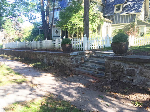
Hi Everyone! It's been a while since I posted about exterior progress on the house. I've been doing some toying around with paint colors which I hope to post about soon.  But most recently the big project was fixing our garden retaining wall. Our house sits up from the street and the there is a long stone wall on both street sides of the property.  The wall was in ok conditions in certain places and was completely falling apart in others. There was a large vine (think 4" diameter) coming out of the wall in one location.  We decided to go ahead and have the wall repaired so that we could plant in the bed between the fence and the wall come spring.  We also decided that the side entry to the house was way too narrow. Some people would walk past it and miss it altogether, so now was the time to widen it and make it more welcoming.  Here is what it looked like last fall before we cut down that awful vine.

Cutting it down improved it but then just revealed the damaged wall behind.


Here is some progress from when we built the fence and added our patio.


And here it is in progress.


As you can see, we also added a retaining wall next to the driveway (which allowed us to get rid of some rotting railroad ties and gives us space for planting). We also expanded the back patio space so our Airbnb has a little bit of outdoor space as well.  Here are some final shots of the wall and garden area (added a few shrubs which will screen the driveway nicely in the future).


 I'm excited to get fall cleanup started but sad that our planting season is coming to an end. Time to do some plant research and planning for next year! and finalize our exterior paint colors.