Monday, June 26, 2017

Jess's Millburn Residence Kitchen Floor

Hi Everyone!  Jess D here.  We were so thrilled that House Beautiful featured my Millburn house's kitchen in its June 2017 issue and thought it would be a good idea to revisit the kitchen floor stenciling process before we dive into the painting of my new kitchen floor.
It's hard to believe this is what our kitchen looked like before we purchased our home.

After some demo, new cabinets, french doors, paint, fixtures, and of course Nest Studio Hardware, we replaced and primed the plywood subfloor.
 Here is the first coat of glaze I used to darken the floor and give it more dimension.
And this was the idea for the final concept.
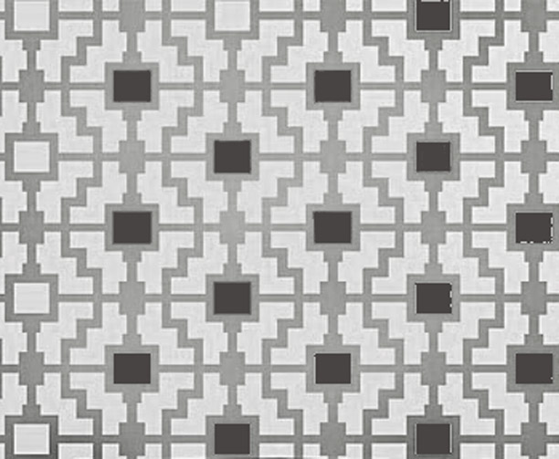
I received my Shipibo Allover Stencil from Cutting Edge Stencils and flattened it out to prepare for the stenciling process.
I started at the top end toward the middle of the kitchen and then worked my way out using a dry firm foam roller applying very little pressure as per the instructions.Because I wasn't worried about an even coat - I wanted a patina'd look - the first few rows went fairly quickly.
The edges and corners, however, got a little rough.  Paint was starting to goop under the stencil despite how little pressure I was using and I spent quite a bit of time going back and wiping both the floor and the stencil.  The edges weren't as crisp because of the goopage and the fact that paint started drying around the edges of the stencil openings caused lines to be less straight.  By far the most challenging part was going in and out of the corners.
 I ended up having to use a brush and doing some hand fudging.  Here is what it looked like further along.
By the time I finished all the edges and corners the center was dry enough to walk on.  I was pretty happy with the results.  So I opted to use the dark charcoal grey that I had used for the glaze on the rectangles rather than the black paint in the original concept.
A few days later, I moved on to the next step -- clear coat.  I put on two coats of Polyurethane.
 In the end it turned out great and proved to be pretty durable.  It was also way less expensive that going the route of encaustic tile.  I give stenciling two thumbs up -- a huge impact at a small cost - which is why I decided to do it again in my current kitchen. Stay tuned for a play by play on that project coming up!




Wednesday, June 21, 2017

Bold Gender Neutral Nursery

Hi all, it's me Kate Cabiltes!
I came across the charming flat of London retailer Alex Eagle on Domino recently. Each room is thoughtfully designed and filled with beautiful vignettes much like one of her shops. My favorite spot is her 6 month old's nursery which is bold yet refined and can be appreciated for its design sensibilities. The paper mache animal head statement wall is adorable but the striped red and white wallpaper which lines even the built in shelves to make the stripes continuous is the best. The mid century furniture pieces that anchor the room bring help from some of the greats: Serge Mouille (the light), Fritz Hansen (the chair) and a white rounded crib from Anita's House. While the three-arm ceiling lamp she uses is amazing, a more cost effective (and colorful) alternative would be this Midcentury Chandelier from Pottery Barn Kids.


Here's how to get the look in your nursery...


Orla Red & Gold Wallpaper via Graham & Brown
Serge Mouille Three-Arm Ceiling Lamp via Design Within Reach
Elephant Crib via Oeuf NYC

Inspiration image via Domino

- Kate

Monday, June 19, 2017

Musso Design Group: Design Spotlight

Heather here . . . with our Monday Nest Studio Design Spotlight.  This week we are featuring the transformative work of Atlanta's Musso Design Group.  Musso takes their charge of inspiring clients seriously.  As evidenced by their work, Musso curates places of beauty that fundamentally lift the human spirit.  The Musso team states:

"Our deepest purpose is to help draw from within all we touch, those feelings that captivate and inspire.  Musso.  A source of wonderment.  A source of beauty.  A source of warmth.  A source of inspiration.  A view of life.  A way of life.  Our purpose is simple.  Help those we touch to live a life inspired."  

I appreciate how this firm poetically thinks and writes about design.  Their ideology seems to elevate their design work to something almost esoteric.  Their real life designs achieve a highly livable style.  Thoughtfully selected artwork, material objects, and furnishings blend together to create a cohesive interior, often with a wink, a nod, and a good dose of humor.

Check out our @neststudiohardware Instagram feed this week for more work by Musso Design Group.  A sampling can be found below:


Monday, June 12, 2017

Annie Downing: Design Crush

Hi folks, Heather here with our Monday Design Crush.  This week we are featuring the sophisticated stylings of Annie Downing.  Annie's interiors are a livable luxurious combination of eclectic and bold.  Downing has an knack for timeless detailing, distinctive accessorizing and unique color combinations.  Annie also has a fashionable showroom in the 'Design District' of Austin, Texas.  Here you can see first hand her freshly curated vintage furniture collection, accessories and upholstered pieces.

Check out our @neststudiohardware Instagram feed this week for more work by Annie Downing.  A sampling of her work can be found below:


Wednesday, June 7, 2017

Cozy Farm Kitchen

Hi, it's Kate Cabiltes!

I came across this home tour featured on Domino by Studio McGee and was in awe of how this Salt Lake City based firm transformed a drab 1930s kitchen to a cozy yet bold room. The open shelving on the squared (as opposed to typically rectangular) subway tiles makes for endless storage and display possibilities. The colors throughout are simple yet eye catching. The jewel toned green cabinets pop against the whites and neutrals and the brass hardware and light fixture add some yellow undertones which make the area shine. Whether you take cues from one of many of the pieces of this look, the transitional nature of this style could easily be mimicked in almost any kitchen.


Here's how to get the look in your kitchen...


Cordless Roman Shade via Pottery Barn
English Lake Scene Painting via One Kings Lane
Studio Green Paint via Farrow & Ball
Sage Sconce via Schoolhouse Electric

Inspiration image via Domino

Monday, June 5, 2017

Young Huh: Design Crush

It's Heather Kilmer here, with our Monday morning Design Crush.  This week we are featuring the impeccable work of NYC designer, Young Huh.  Known for her irreproachable attention to detail, Huh intimately layers her clients' history, personality and cultural experiences into their homes.  She states,

"A rule that I do follow is to decorate with family heirlooms even if some of them are not-very-valuable hand me downs.  They have the greatest impact when you group them together."

Like her clients, Young Huh's projects each have a unique style and point of view.

Young also brings a broad global perspective to her work and an extensive range of design styles.  Her discerning eye and design skills allow her to effortlessly work in a variety of styles from classic to transitional to modern.  Always firmly rooted in tradition, her interiors reflect her love of art, craft, materials and textures.  Beautiful fabrics, classic furnishings, and flowers are among her typical palette that create a livable luxe interior.

Check out our @neststudiohardware Instagram feed this week for more Young Huh projects.  A sampling of her work can be found below: