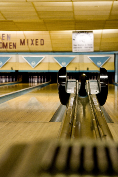
So, I finally decided on the Shipibo Allover Stencil from Cutting Edge Stencils for the kitchen floor. Right now the space looks like this.
I colored up the stencil and I'm liking the deco feel with a little bit of an encaustic tile look.
I can't decide though if I want to add some black to make it more contrasty
Or even a little bit of rust (or does it start looking to native american?)
The good thing is that I can paint it and live with it for a while and make a decision. I'm so excited to get going on this project next week. And if I have a little bit of extra time I might even treat you all to a little photoshop rendition so we can see it before the real thing. Which version are you leaning toward?
Showing posts with label Graphics. Show all posts
Frutto Probito
Monday, December 3, 2012
So, one of my favorite rooms in the house (and one that is the most done) is the powder room. I decided to splurge on a Cole and Sons wallpaper called Frutto Probito. I love how it has a traditional bent and that the colors tie in to the palette in the rest of the house, but that it's playful at the same time. I have a little monkey figurine that I can't wait to dig out and put on the back of the toilet. The pendant is from Rejuventation (which has so many great vintage-style fixtures) and the mirror was an antique find for just $60!
Dogear Press on Minted
Thursday, October 25, 2012
As many of you know, my sister-in-law Soyoung does graphic design as a hobby along with her wonderful blog Dogear Press. Recently, she created Bryan's fun first birthday invites. She's also submitted a few designs to Minted and a couple days ago, had one of her submissions selected as an Editor's Pick in their “Happy 2013 Challenge”. It's a fun design - simple and current (no, that is not a picture of her family). You can purchase her design here. Congrats Soyoung!
Photos courtesy of Minted
Now if only I could get around to taking some photos and actually sending out cards.Bryan's First Birthday
Tuesday, October 9, 2012
I can't believe it's right around the corner. Our little guy will be turning 1! We're planning an animal themed fete to ring in his first year. Soyoung from Dogear Press helped us design this interactive invite (unfortunately the links don't show up on blogger) and Kelly from Studio DIY is helping us with the concepting (craft paper pinwheels and spray painted plastic animals are on the agenda). Can't wait to show you all the party in full swing.
The giraffe icon was obtained through the Noun Project and designed by Saman Bemel-Benrud, Organization MapBox
HELP!
Thursday, February 16, 2012
So the Eagle's Nest is in need of a little revamp. I love my logo and font but let's be honest, the Eagle's Nest is not exactly "A local guide to all things relevant." For one, aside from my own house and the local sources I find and use, the rest of my blog is fairly universal and non location specific. I try to keep things relevant but I don't cover politics, the economy, science etc, so who am I kidding, I'm certainly not writing about ALL things relevant. So first off, I'm in dire need of a new tag line. It can be a series of words, a phrase as it was before, or something humorous and off-kilter. I'm just not sure what it should be. I did a little brainstorming below but would love any reader input.
Secondly, I was reading Bri's post about color at Design Love Fest. Color is so important. Right now I'm not sure about the colors of my logo / banner. I like the dark color of the text and logo but the papery background may be a little too "eco" looking for me. I love to be green, but that isn't necessarily the look I'm going for. So I started thinking about colors I like - colors that I love in interiors, in fashion etc. Generally speaking I'm not a kelly green, fuschia preppy girly girl. I love masculine colors in interiors and fashion - navy, black, every shade of grey. With a pop of white and maybe a chartreuse and burn orange and some brass mixed in. I'm thinking my palette looks sort of like this. What are your thoughts on color? When you think of me and my blog (IF you think about me and my blog at all) do certain colors come to mind?
Sponsor Post: Lucky 8 Letterpress
Tuesday, December 6, 2011
A guest post from our new sponsor and long time friend from my college a cappella group (think the Sing-Off), Cindy Lin:
Hi Eagle's Nest readers!
I'm Cynthia Lin, of LUCKY 8 LETTERPRESS, and I'm jumping in today to guest-post a little Q&A about letterpress printing. I invite you to check out the Lucky8 Etsy shop - use coupon code "EAGLESNEST" and get free US shipping through the end of the year!
Q: How did you get into letterpress?
A: I got into letterpress through another artistic pursuit - I'm also a singer-songwriter. (Fun fact for readers - Jess and I were in an a cappella group together in college!) My first album was professionally manufactured - for my second album, I wanted something more personal, and I loved the idea of using recycled packaging and printing CD cases myself. A friend introduced me to the idea of letterpress, and I found a studio in Brooklyn where I could learn to print and rent a press. It was such a thrill to print my own limited edition CDs.
Other musicians began asking me to print CD cases for them, and then just by word of mouth I was printing invitations, business cards, bookmarks, stationery, custom wedding favor CDs. Now I'm printing non-stop.
Q: What is your process? Do you have your own press now?
A: I recently moved to San Francisco, where the handmade arts are extremely popular, and I found a great studio to rent a letterpress. I print on a Vandercook, which weighs nearly a ton - if I ever move out of the city, I might get my own, but for now, I'm happy to rent and have someone else maintain the press.
So, the reason letterpress printing is so expensive is because there are so many steps and details to the craft. First, you need a design that's letterpress-friendly: line art and type work best, large solids require more finesse to ink properly. Second, I make a plate of the art, which has the negative (mirror) image and gets placed on the press bed.
Third, I mix ink, add ink to the rollers, adjust roller height and paper alignment, and pull a print to check my initial ink density, print impression, and paper registration. Because each paper has a different thickness, softness, ink absorbent quality, and color, every project requires fine adjustments. This fourth step is where letterpressers drive themselves crazy, in a neurotic, fulfilling way. I might add tiny dots of ink, or clean off a touch of ink, or double ink each print. I may add a bit of tissue-paper packing to get a hair more impression, or feed an extra sheet. It might take 30 proof sheets to get the print quality that I want or I might hit it on the first try. When I'm finally ready to print, I hand-feed each sheet through the press one by one, and keep a close eye on ink consistency and registration. Beyond printing, I spend time experimenting with different papers (including brown recycled chipboard and black cotton museum board).
Q: Where do you get your inspiration?
A: I'm a total nerd for the craft of letterpress printing -- my goal is to create designs that will maximize the beauty of ink, impression, and paper. I love white space, bold color, super crisp impression, unique papers, and ultimately I enjoy "petting" the paper and running my fingers over the textured details.
For custom work, it's important to me to capture the personality of whomever I'm creating for. I love hand-drawings, which I can turn into digital art to print. I am also a big fan of typography - the right font makes all the difference, and I often create custom fonts to perfectly suit each project.
Q: Why do you think these sorts of hand-made arts are making a comeback?
A: First of all, it's hugely satisfying to make real, physical things. Most people have jobs with no tangible product. When you work with your hands, there's a rush, an instant gratification, and a sort of soothing magic that comes, and you love whatever you made, no matter the imperfections. Second, the ease of digital reproduction has made us run towards one-of-a-kind goods. It's an expression of individualism - we want to define our own style and embrace our idiosyncrasies. I love buying hand-made goods because I know I'm directly supporting someone's artistic expression and encouraging more creativity.
Thanks Cindy! Stay tuned for a post about the beautiful announcement Cindy did for Baby Bryan's birth.
Hi Eagle's Nest readers!
I'm Cynthia Lin, of LUCKY 8 LETTERPRESS, and I'm jumping in today to guest-post a little Q&A about letterpress printing. I invite you to check out the Lucky8 Etsy shop - use coupon code "EAGLESNEST" and get free US shipping through the end of the year!
Q: How did you get into letterpress?
A: I got into letterpress through another artistic pursuit - I'm also a singer-songwriter. (Fun fact for readers - Jess and I were in an a cappella group together in college!) My first album was professionally manufactured - for my second album, I wanted something more personal, and I loved the idea of using recycled packaging and printing CD cases myself. A friend introduced me to the idea of letterpress, and I found a studio in Brooklyn where I could learn to print and rent a press. It was such a thrill to print my own limited edition CDs.
Other musicians began asking me to print CD cases for them, and then just by word of mouth I was printing invitations, business cards, bookmarks, stationery, custom wedding favor CDs. Now I'm printing non-stop.
Q: What is your process? Do you have your own press now?
A: I recently moved to San Francisco, where the handmade arts are extremely popular, and I found a great studio to rent a letterpress. I print on a Vandercook, which weighs nearly a ton - if I ever move out of the city, I might get my own, but for now, I'm happy to rent and have someone else maintain the press.
So, the reason letterpress printing is so expensive is because there are so many steps and details to the craft. First, you need a design that's letterpress-friendly: line art and type work best, large solids require more finesse to ink properly. Second, I make a plate of the art, which has the negative (mirror) image and gets placed on the press bed.
Third, I mix ink, add ink to the rollers, adjust roller height and paper alignment, and pull a print to check my initial ink density, print impression, and paper registration. Because each paper has a different thickness, softness, ink absorbent quality, and color, every project requires fine adjustments. This fourth step is where letterpressers drive themselves crazy, in a neurotic, fulfilling way. I might add tiny dots of ink, or clean off a touch of ink, or double ink each print. I may add a bit of tissue-paper packing to get a hair more impression, or feed an extra sheet. It might take 30 proof sheets to get the print quality that I want or I might hit it on the first try. When I'm finally ready to print, I hand-feed each sheet through the press one by one, and keep a close eye on ink consistency and registration. Beyond printing, I spend time experimenting with different papers (including brown recycled chipboard and black cotton museum board).
Q: Where do you get your inspiration?
A: I'm a total nerd for the craft of letterpress printing -- my goal is to create designs that will maximize the beauty of ink, impression, and paper. I love white space, bold color, super crisp impression, unique papers, and ultimately I enjoy "petting" the paper and running my fingers over the textured details.
For custom work, it's important to me to capture the personality of whomever I'm creating for. I love hand-drawings, which I can turn into digital art to print. I am also a big fan of typography - the right font makes all the difference, and I often create custom fonts to perfectly suit each project.
Q: Why do you think these sorts of hand-made arts are making a comeback?
A: First of all, it's hugely satisfying to make real, physical things. Most people have jobs with no tangible product. When you work with your hands, there's a rush, an instant gratification, and a sort of soothing magic that comes, and you love whatever you made, no matter the imperfections. Second, the ease of digital reproduction has made us run towards one-of-a-kind goods. It's an expression of individualism - we want to define our own style and embrace our idiosyncrasies. I love buying hand-made goods because I know I'm directly supporting someone's artistic expression and encouraging more creativity.
Thanks Cindy! Stay tuned for a post about the beautiful announcement Cindy did for Baby Bryan's birth.
GIVEAWAY: Cutting Edge Stencils
Monday, August 22, 2011
Lately, I've been a bit obsessed with surface decoration. From the awning stripe on the baby's ceiling to my plans to do a faux bois wall in the powder room and a chinoiserie in the bath. Well, Cutting Edge Stencils to the rescue! Have you checked out this website before? They have some amazing patterns. And when you don't want to commit to an expensive wall paper, this is the way to go. They even have How To Vidoes on Youtube that make the process that much easier. Cutting Edge Stencils has agreed to give one lucky reader their stencil of choice (up to a $50 value). Just visit their site and comment back with your favorite stencil. Extra entries for those who like Cutting Edge Stencils on Facebook. Here's a sampling of some of their wares (well, my faves anyway).
And some installed applications.
The fine print
- All entries must be followers of the Eagle's Nest
- Must live within the contiguous United States
- Giveaway closes on Friday August 26 at 4pm PST.
And some installed applications.
The fine print
- All entries must be followers of the Eagle's Nest
- Must live within the contiguous United States
- Giveaway closes on Friday August 26 at 4pm PST.
Cutting Edge Stencils
Tuesday, March 29, 2011
So, I've been considering what to do with our existing powder room. One day down the road (the key words being "down the road") we plan on replacing the powder room with a laundry area and creating a full guest bath in our current laundry. So as much as I would love to turn my powder room into a beautiful jewelbox, I just can't justify spending money on a fancy wallpaper just to rip it down in a few years time. Plumbing fixtures and lighting can be moved, but not wallcovering.
Cutting Edge Stencils to the rescue. They have some great patterns that I think would work well as feature walls, powder room walls etc. Not your typical Americana Mary Englebreit looking stencils, these ones are way radder (is that a word?), funkier, and stylish. Here are some options I'm considering (check out their website, this is just a sampling of what I like, but there are tons of other patterns).
Now, I just have to figure out what colors to use. Maybe shades of grey? Tans? dark sea blues? Considering my recent aversion to color, I'm hoping I don't also develop an aversion to pattern.
Cutting Edge Stencils to the rescue. They have some great patterns that I think would work well as feature walls, powder room walls etc. Not your typical Americana Mary Englebreit looking stencils, these ones are way radder (is that a word?), funkier, and stylish. Here are some options I'm considering (check out their website, this is just a sampling of what I like, but there are tons of other patterns).
Now, I just have to figure out what colors to use. Maybe shades of grey? Tans? dark sea blues? Considering my recent aversion to color, I'm hoping I don't also develop an aversion to pattern.
Killswitch
Tuesday, February 15, 2011
After working long and hard on my blog logo, duvet set labels, and business cards, I thought it was about time to introduce the talent behind Nest Studio's graphics. Meredith Reshoft is a great friend from high school who is now Principal and Creative Director of The Killswitch Collective, a Chicago-based creative agency. She's been with Killswitch since its inception in 2004, overseeing and maintaining the creative excellence that the firm seeks to deliver to all of its clients. Killswitch's work is as varied as their clients, which include both larger companies such as the Viacom family of brands, NIKEiD, Concur Technologies, Disney, UCSD, Motorola as well as smaller local companies including, Vosges Haut-Chocolat, Gen Art, Wicker Park/Bucktown Chamber of Commerce, Pitchfork, and many more.
I have to say that I'm honored to be among the ranks for Killswitch's many amazing people and companies they have worked with.
Trina Turk Outdoor Collection
Wednesday, February 9, 2011
Trina Turk's 2011 Outdoor fabric collection for F. Schumacher has hit the showrooms. And it's hit with quite the bang! Saturated hues, a little psychadelic and with her signature West Palm vibe, the collection is definitely a winner. I wish I were doing someone's poolside lounge, as this would be perfect. Also perfect for anywhere where durability is an issue. Breakfast room banquettes, kid-proof pillows, anyone?
Of course, these oldies-but-goodies in her line are pretty stellar too. I love that the new collection coordinates with the old.
Society 6
Monday, November 22, 2010
Well, these days it seems that every label is trying to become a lifestyle brand, creating capsule collections, using local artisans, etc etc. I previously posted about Urban Outfitters' partnering with Republic Bicycles. Well, they're also working with Society 6, an online community of global artists. You can purchase prints through their print shop and at $25 a pop for a 17" x 23" print, it's a great way to start a collection of one of a kind artwork. Here are some of my favorites:
Pappy's
Woodchucks
Playin' in the sprinkler
Mamilla Sky
Coney Island Beach
Pappy's
Woodchucks
Playin' in the sprinkler
Mamilla Sky
Coney Island Beach
Love is in the air
Tuesday, November 16, 2010
My sister-in-law Soyoung just entered Minted's Happily Ever After Wedding Invitation Design Challenge. She's passed the first round of over 1400 entriees and now it's up to you all to select her design to be part of Minted's 2011 wedding collection.
I love how this is mod, graphic, unique and fun. If you like what you see too, vote for her design here (in order to do so, please sign up for a Minted account - they have such cool stuff!)
My new favorite
Friday, October 29, 2010
Custom holiday cards from Rifle Paper co. I wish I could bring myself to get something like this made, get an address book together, send out holiday cards etc etc. One of these days. Or I'll stick to the tried and true Ahnert tradition of sending out a Chinese New Year email. It's greener right? But these cards are so damn cute!
SALE!
Wednesday, May 19, 2010
Yes, that's right. Charley Harper is having a notecard sale, so stock up. His wonderful animal illustrations are perfect for even the pickiest recipient - baby showers, gifts for mothers-in-law, secretary's day (oops, I meant admin assistant day).
Subscribe to:
Posts (Atom)