Stylin' Mamma: Did Somebody Say Party?

Sunday, December 29, 2013

Perhaps it's a sign that our kids are getting older and we're (finally) dusting out the baby-brain cobwebs, but after a few dry years the holiday party circuit is CRACKLIN'!
I won't lie: I'm delighted.  Season after season I have stared at my festive wear and wondered if I should just give up the ghost and clear it out.  But now, all of a sudden, we're staring at 5 invitations to events big and small, glammy and casual, and my closet is back in action!  Somebody pour me a Cosmo and let's get to it!

THE BIG BASH

If you can't go large at Christmas, when can you?  This is the moment to break out the spangles.  A mini dress is great indoors but be sure to bring a cozy coat for the walk home.  I never shy away from a killer shoe but sometimes it's wise to bring a clutch big enough for a late-night flat.

If the invitation calls for a bottle to share, check out the gifty packaging of Sofia minis -- guaranteed to be the most effervescent offering on the table. 

THE FIRESIDE CHAT

For a cozy holiday open house event, something more understated is appropriate.  I like jersey pants because you can easily post up on the floor by the fire for casual catching up.  A festive sweater gets you from here to there, and deco earrings dress it up.  Red finger and toenails add holiday cheer.

For a hostess gift, I like pretty tableware, and these Ten Lords a Leaping placecard holders are just subtle enough to avoid Christmas kitsch.  

Of course, you're never fully dressed without a smile (and a great mani-pedi).  
 
Happy New Year!
 

The Holidays at Chez Davis

Wednesday, December 18, 2013

While the amount of time between Thanksgiving and Christmas was short and led to a rather stressful and hectic holiday setup weekend, I'm happy we went to the effort.  It's been nice to have lights and candles and stockings and a tree up. Last year we were mid-renovation so our decorations were pretty meager.  This year Bryan understands Christmas and Santa a bit more (Santa, if you're reading this, he's been a good boy - by his definitions - and would like an Elmo and a Giraffe), so it's been more fun to have all of the decorations and holiday spirit around. This past weekend was nice and snowy. We made cookies and did some sledding (injury and all) and even got a snowman in.  Here is what our holiday season is looking like.  Hope everyone else is enjoying it as much as we are!


Our house on apartment therapy

Monday, December 16, 2013

I showed you all a few photos of some staging I did for our Apartment Therapy Shoot last week. Well, the house tour is out! I'm really excited about the different views it shows of our house (as opposed to the Woman's Day shoot) and I love all the vignettes that Pablo included in the tour.  Here are a few of my faves. Check out the full tour here.


Stylin' Mamma: Stompin'

Wednesday, December 11, 2013

'Tis the season to wear boots, and the good news is, they're everywhere.  Short, tall, dressy, casual, bright colored, classic...Nordstrom's shoe department is a big old boot fantasy these days!

After much debate, I landed on these for 2013, and may I say, I'm *quite* pleased with them!  Comfy, practical, unusual, and versatile (you can zip them up for a skinny midcalf fit too).
I don't know about you but I hate wearing long pants in the winter.  The ground is ucky (especially in rainy and snowy climes) and I feel like I get home at the end of the day with my trouser hems all a mess or my jeans heavy and damp.  Tights and skirts keep it light while also holding the elements at bay...plus they look a bit sassy, too, for holiday shopping downtown.

A sculptural skirt in a traditional print gets a pop of color from textured tights and a small cross-body bag (best not to be weighed down when you have presents to gather).  The rest of the look stays neutral and warm -- layers, layers, layers! -- with a chambray shirt under a cashmere sweater, all wrapped up in a poncho.  Gloves keep your fingers warm as you stomp from store to store!  

Happy Hunting!

Staging with florals

Friday, December 6, 2013

On Wednesday our house was shot for an Apartment Therapy house tour. I'm super excited to share it with you when it goes live (in about a week or so). It was a completely different experience than the Woman's Day shootWoman's Day involved a photographer, assistant, stylist, hair and makeup person, editors, props and an entire day of arranging and re-arranging. The Apartment Therapy shoot was one guy, a camera, some lenses and a light.  If you read both of these online and print publications, you'll know that Apartment Therapy likes more candid shots and lots of tight vignettes versus the more polished shots that grace the pages of Woman's Day.  Since Wednesday's shoot didn't come with a stylist and a van full of props and florals, I had to do my own styling (which was nice because I get to keep the props this time).  I bought some grocery store florals and used some of my new found knowledge from the garden club I am joining.  Here is an arrangement I did for the dining room in one of my favorite vases from Target (along with a new plant that replaced the fig that finally bit the dust). 


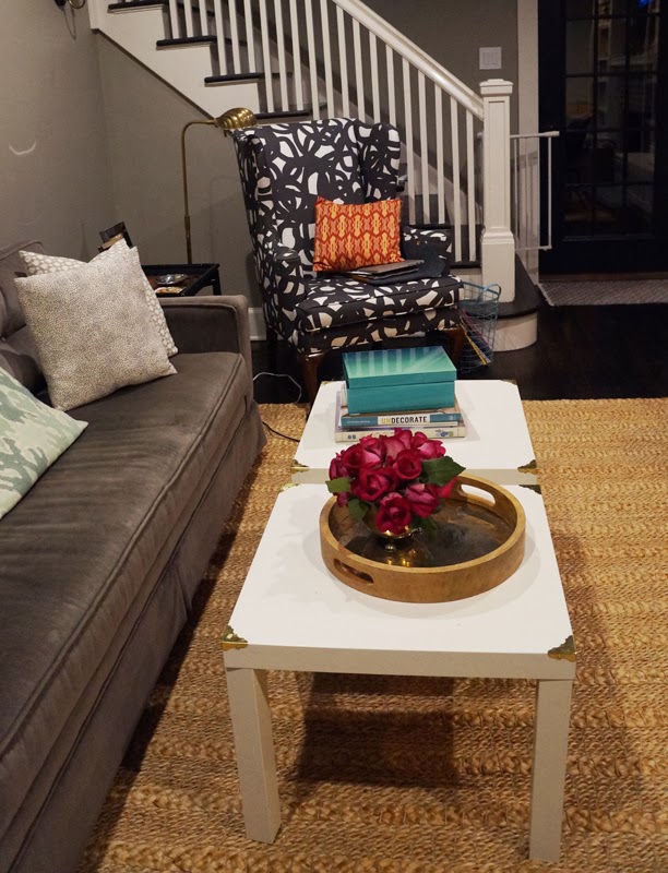
And another arrangement in the living room that I did in a fun footed brass bowl I got at a garage sale.


Storage Solutions in the breakfast nook

Wednesday, December 4, 2013

Thanks to Bryan's propensity to get food all over the floor, we have been using the breakfast nook a lot, especially, well, for breakfast.  It's nice to have him sit in his high chair while I'm prepping. The only issue is that the space is small and we like to read books while we eat (as in, that's the only way to get food in his mouth) so there was always a big pile of books on the breakfast table.  Also, the napkins and wipes were always too far away on the dining room bar cart.  Here is where I would normally include a before pic, but did I mention that I have a serious case of pregnant brain and I thought I'd taken one but apparently did not?  So instead here is what it looks like now.  Don't you love that green faux-malachite tray on the island that I picked up from Home Goods. Thinking about it for a client but I love it here too.  I like that I'm bringing in a darker green around the house in the step stool and bathroom tray and now here.


You may ask, then where did the books go?  Just around the corner.  Ballard wall storage to the rescue.  I got this two tiered wall organizer. It's perfect for library books and napkins and wipes.  Everything is close at hand but neatly tucked away and not taking up valuable space on the table.

Now if only I could get around to actually sewing the cover for the window seat cushion...

Step Stool Project

Sunday, November 24, 2013

A few weeks ago I mentioned that I'd gotten a step stool from a local salvage store. Here's a reminder of what it looked like.  Cute, step stool but a little too shabby chic.
Well, somehow between work, a trip to Dallas and a sick baby I managed to get it painted and, this weekend, got the treads and nails heads put on.  I love the results!  I chose a deep / dusty green for the body to tie into other greens going on in the house (and to add a pop of color in the bathroom) and a charcoal for the trim to tie into the roman shade trim.  I started by giving the piece a quick hand sanding and rub down with a tack cloth. Thank God it hadn't gotten so frigid that I couldn't work outside. 

Then I started in with a water based alkyd paint.  I learned this trick from Little Green Notebook. Cleanup is easier than an oil but has the same self-leveling characteristics that give a nice smooth finish.  After giving the body of the stool two coats and letting that dry, I added the grey trim with a small brush.  As you can see, I also removed the treads and painted those green. The black plastic was a little brittle so I cut it down a bit since there were some tears where I removed the previous nail heads. 

Then came attaching the rubber treads with brass nail heads. This was a bit of an experiment. In my head I wanted a small-ish nailhead about half the size of your typical upholstery tack.  I had originally bought some brass nails from home depot that ended up being too big and long.  Instead of returning to the hardware store I sourced some doll house nails online. They were the right length but the heads on the nails turned out to also be doll house scaled.  They were basically like tiny short straight pins - ridiculously small (this is when an online image would have been handy).  Back to Home Depot.  I bought some escutcheon pins whose heads were a little smaller than I hoped.  I figured if I did enough of them around the rubber it could look cool.  I also bought some brass thumb tacks as a back up.  Well, the escutcheon pins took a lot of pounding to get in.  Then they started bending on the last pound and were next to impossible to get out without ruining the painted rubber.  So I went on to the thumb tacks which worked wonderfully. That is how I ended up with a pattern of thumb tacks and escutcheon pins on the front edge.  I like the decorative look though and love how the brass dresses it up.


I also added a bit of green in the form of a small West Elm tray to corral various bathroom items that we keep out on the counter.  I added a couple of silicone bumpers on the bottom to keep it off the counter and from getting wet (from the inevitable water creepage).


Stylin' Mamma: Red

Wednesday, November 20, 2013

I love a red shoe.  Why wear black when you can add that interest that is red?

Okay, let's be honest.  I love a shoe shoe.  If it's a shoe, I'm at least going to consider it.  I may not adopt it (the goth platform boot, for example), and I may not adore it, but I'll consider anything shoe-related.  But for the purposes of this post, I love a red shoe, and more specifically, I love a red shoe with a pointy toe just peeping out of an otherwise basic or conservative trouser.

Not that these trousers are basic, no sir.  First of all, how comfy do they look?  Yet how workplace appropriate?

A part of me (the mom part) is digging this season's take on comfy-classy.  Pajama- or active-wear-inspired styles are pretty much a slam-dunk for a gal who yearns to be elegant but (let's face it) spends an inordinate amount of time looking for lost Legos and water bottles that have rolled under the seats of the car.  So you can imagine how I swooned for Old Navy's embellished sweatshirts, how I raced to Fourth & Market and snapped one up to wear to early Fall soccer practice with black jersey pants.  

For a busy day, an oversized clutch has room to spare.  And the good news is, with a neckline like that you don't have to overthink your jewelry: a couple of stacked rings (here and here) by the stylist behind Damsel in Dior ought to do the trick.

Look at you: the Lady Who Lunches, the Lady Who Lounges, the Lady Who Lugs kids and bags and snacks all over town...Hey, I'm digging those red shoes!
-Jaime

On the books: PS 450

Monday, November 11, 2013

A few of your have requested more updates on the work I'm doing for residential and commercial clients.  It's always tough to know when to do these posts. Usually there is a before post but I like that to happen after the design scheme and selections have been completely nailed down. Then there is an after post which requires staging and good photography which often happens a while after a project is complete.  I think I finally have a few things to show you guys.

First off is a bar project I'm working on in the city. Some of you may have been to PS 450 back in the days when I lived and worked in New York or perhaps more recently.  The client is someone who I had worked with in the past and was happy he tapped me for this project now that I'm back in the hood.  PS 450 holds quite the raucous twenty-something boozy brunch and they also do a great lunch and happy hour.  The name refers to its Park Avenue South location but I also like the play on the New York public school naming convention.  Here is what the bar looks like now. A little tired and dated, almost too mod and clean lined for the current more retro industrial trends.


I wanted to add more detail and sort of play off the public school theme. There were a few things we had to keep like the mirrors, floors, bar, back bar and ball chain curtain in the back, and we had a very limited budget. I think the final look will be nice and classic and not overly themey.  Here is the design board I created.  My sister-in-law Soyoung from Dogear Press is helping to design the chalk art wall that has words that reference the fare and libations at PS 450.  

Bryan's Birthday Bash #2!

Tuesday, November 5, 2013

Last year we celebrated Bryan's first birthday with an animal themed birthday bash.  This year, at the ripe age of two, Bryan had more of an opinion so we went for a choo-choo themed event.  My sister-in-law Soyoung from Dogear Press designed the ticket-style invite.
Luckily the weather cooperated so we were able to hold the event outdoors, complete with duct tape choo-choo track, conductor hats, and train whistles.


As you can see Bryan wasn't very thrilled by all the singing and hoopla surrounding the birthday cake.


 Happy Birthday to our fun little guy!  It seems like just yesterday that we were bringing him home from the hospital in Pasadena.

All photos courtesy of Dogear Press