The New Traditionalists

Wednesday, April 26, 2017

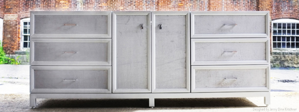
Nest Studio is thrilled to announce our collaboration with the people who make trad furniture cool again, The New Traditionalists.  Their handmade furniture breathes new life into classic silhouettes.

Designed in New York City and manufactured in New England, The New Traditionalists uses old world furniture making techniques such as hand rubbed finishes, grain matching, kiln dried frames, hardwood construction, and hand tied springs.  Their furniture also is made from sustainable hardwoods and non to low VOC finishes that qualify for LEED points . . . connecting tradition with today.

We are so thrilled to pair our hardware with their fabulous handcrafted furniture.  Check out a sampling of their work below:


Rich Layered Living Room

Hello, Kate Cabiltes here!

Architectural Digest recently featured a Nashville home tour of British model and musician Karen Elson and I was instantly enamored with several of the rooms but most of all her living room. As a true lover of green (which also happens to be the Pantone Color of the Year) it's no surprise that this space is a favorite. In addition to the rich jewel tones that fill the room, the shapes and patterns are sophisticated without being stuffy. The angles on the lacquered bracket foot coffee table play off of the pattern in the Turkish rug. Touches of brass and cerused wood give this vignette added class and the live greens and florals are a pop of bright detail that casually complete the look.

Here's how to get the look in your living room...

Tailored Pleat Drapes in Willow via The Shade Store
Blue Doodle Flower via One Kings Lane
Vintage Book Stack via Etsy
Red Lacquered Coffee Table via 1st Dibs
Architect's Mini Double Floor Lamp via Circa Lighting
Velvet English Fireside Chair via Anthropologie
Amanda Turkish Rug via Amber Interiors

Inspiration image via Architectural Digest

- Kate

Exterior Paint colors finalized

Tuesday, April 25, 2017

Hi Everyone!  Jess D here. It's spring and our house is being painted this week! Well, rather, they are starting the stripping, priming and then the painting which is going to be a multi-week process. But I'm excited to document it for you. That said, I realized I never gave an update on the finalized paint scheme. There had been several options. I even entertained the idea of adding some pinky peach in there and hemmed and hawwed over painting the window sashes and storms. But I think I've come to a final decision.  Here is what I'm thinking.

I realize that the dark blue/green/grey looks almost black on some of your computer screens, but don't fret, I've sampled it in person.  I also did a couple of new mock ups on some closer in areas of the house to get an idea of how it would look. It's a bit tough to photoshop the areas in shadow but I'm generally happy with the overall idea.


Ignore the plywood panelson the stained glass windows that are being repaired.  And stay tuned as we peel back the layers and put this lady back together!

Steven Harris & Lucien Rees Roberts

Monday, April 17, 2017

This week we will highlight the collaboration between architect, Steven Harris and interior + landscape designer, Lucien Rees Roberts.  Their impeccably crafted combined work explores the design potential of residential life and the intersection between architecture, interior and landscape. As can be seen in there compelling projects, it is clear they both challenge and compliment one another where their scope seamlessly overlaps.

Harris and Rees Roberts' varied work is unique in character and distinctive in its point of view creating a narrative for life.  I am struck by their use of natural light and site lines to surrounding nature, use of color-subtle or bold, and clear love of art.  The result is an utterly bespoke and unique experience of space, time and inhabitability.

Check out our @neststudiohardware Instagram feed this week for more on Steven Harris and Lucien Rees Roberts.  A sampling of their collaborative work can be found below:


All images are taken from Steven Harris Architects website.  Photographs are by Scott Frances or Ty Cole.

Urban Farmhouse Reveal: Outdoor Living

Tuesday, April 11, 2017

Hi Everyone! Jess D back today with the final space in our Urban Farmhouse Reveal. It's been so fun sharing this project with you all. We didn't do any sort of design board for this space as my clients bought most of the furniture and then passed the selections by me.  But when I got to LA they were generally unhappy with the layout and the way the space felt.  I shifted around the seating so it felt more natural and utilized the space better and brought in some finishing touches (pillows, throws and accessories) to soften things up. I love how this space feels and am more than a little jealous of the year-round outdoor living they have in Socal.  My good friend Nancy Knapp at Weeds Garden Design did an amazing job on the plantings (pictured here just a few months old).  Can't wait to see how things look as the plants grow in and become more lush.


Michel Smith Boyd: Design Crush

Monday, April 10, 2017

Michel Smith Boyd is Nest Studio's Design Crush this week.  This well edited Atlanta designer creates cool, contemporary, and luxurious designs.  Inspired by fashion and by travel, Smith Boyd's thoughtfully designed projects are rich with multiple layers of texture, the incorporation of natural elements, and the use of sculptural furniture.

No detail overlooked in his interiors.  I just love his signature soft color palates, luxurious layers, patterns, unique accessories and sexy furniture shapes.  He also has two stunning textile rug lines through Verde Home and Feizy Rugs.

Check out our @neststudiohardware Instagram feed for more on Michel Smith Boyd.  A sampling of his projects can be found below:


Please visit our blog next week for Design Crush, Steven Harris.


Eclectic Vintage and Modern Master

Thursday, April 6, 2017

Hi all, it's Kate Cabiltes!

I stumbled across the talented Rosie Case while perusing a fave blog Sketch42 recently. The home tour of this native east coast editor who moved to Texas and decorated her entire home is jaw droppingly good. Her carefully curated spaces mesh vintage finds with modern classics, often styling Craigslist steals with Vladimir Kagan or Fredrick Weinberg furniture. 


The pieces she chooses are sculptural in an array of color pops and she self proclaims her vignettes as "theatrical". What struck me when reading was how easy she made it sound to achieve looks with such seemingly unattainable pieces. While she undoubtedly has a special eye for interiors I'm looking forward to exploring the web for some hidden gems to hopefully achieve a similar effect in my own space!


Here's how to get the look in your master bedroom...


Olive Tree in Pot via Wayfair
Cactus Silk Framed Textile via St Frank
Malibu Table Lamp via One Kings Lane
S Style Chair via Overstock
Velo Coffee Table via Ultramodern
Souk Wool Rug via West Elm
Kilim Throw Pillow via The Citizenry

Inspiration image via Sketch42